
Mastering Data Analysis in Excel: A Complete Guide for Beginners
Learn how to use PivotTable, PivotChart, and Slicer tools to analyse and visualise data in Microsoft Excel with this comprehensive guide for beginners.
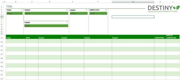
As a VA, I offer a range of services to help ease your day-to-day tasks. In addition to these services, I want to share with you how to use the Slicer feature in Microsoft Excel. The Slicer is a powerful tool that allows you to filter data in a pivot table or chart. By following the step-by-step guide I provide, you can start using this feature today and take your data analysis to the next level. And don't forget to download the interactive Excel sheet to practice using the Slicer feature.
A Slicer is a visual tool that allows you to filter data in a pivot table or pivot chart. It's a great way to quickly and easily see the data you want to see without having to manually filter through it. With a Slicer, you can filter data by selecting one or more items in a list, and the pivot table or chart will update automatically to show only the data that matches your selection.
Now that you know what a Slicer is, let's get started with the step-by-step guide on how to use it.
Step 1: Create a Pivot Table
The first step is to create a pivot table. If you're not familiar with how to create a pivot table, you can check out this guide from Microsoft.
Step 2: Add Fields to the Pivot Table
Once you've created your pivot table, you need to add the fields you want to analyse. To do this, simply drag and drop the fields from the Field List into the Rows or Columns area of the pivot table.
Step 3: Insert a Slicer
To insert a Slicer, click anywhere inside the pivot table, and then go to the Analyse tab on the Ribbon. Click on the Insert Slicer button, and then select the field you want to use as the filter.
Step 4: Customise the Slicer
Once you've inserted the Slicer, you can customise it to fit your needs. You can change the size, colour, and style of the Slicer, as well as the items that are displayed in the Slicer.
Step 5: Use the Slicer
To use the Slicer, simply click on one or more items in the list, and the pivot table or chart will update automatically to show only the data that matches your selection. You can also clear the filter by clicking on the Clear Filter button in the Slicer.
And that's it! With these five simple steps, you can use the Slicer feature in Microsoft Excel to quickly and easily filter data in a pivot table or chart.
In conclusion, the Slicer feature in Microsoft Excel is a powerful tool that can help you quickly and easily filter data in a pivot table or chart. By following the step-by-step guide I've provided, you can start using this feature today and take your data analysis to the next level. But wait, there's more! As promised, I've created an interactive Excel sheet that you can download and use to practice using the Slicer feature. Click on the link below. It's completely free, and it's a great way to get some hands-on experience with this powerful feature.

Last update: May 17, 2023
Explore Similar Topics

How to Create 500 Folders in Seconds
YOU MAY ALSO LIKE

Why Time Management is Critical for Business Owners

Why Virtual Assistant Support is Essential in Today's Digital Landscape

Essential Tasks a Virtual Assistant Can Handle

7 BIG Reasons Why You Should Make Good Admin Your Top Priority Now!